Multiple Choice
Identify the choice that best completes the statement or answers the
question.
|
|
|
1.
|
Which of the following is NOT a measure of
dispersion in a set of data?
a. | mean | b. | histogram | c. | variance | d. | standard
deviation
|
|
|
|
2.
|
The formula below will determine the  a. | population mean | b. | sample mean | c. | mode | d. | median | e. | grouped data
average | f. | weighted average |
|
|
|
3.
|
This formula will calculate the  a. | grouped data median | b. | mode | c. | median | d. | mean | e. | weighted
average |
|
|
|
4.
|
In the formula for standard deviation (for a sample of data) below, the reason
for ∑(x - µ) 2 in the formula is: 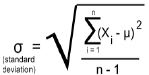 a. | to find all the differences in the data | b. | to sum all the
squares of error in the data set | c. | finding all the deviation | d. | to determine the
standard deviation | e. | to calculate the mean | f. | to measure
volatility |
|
|
|
5.
|
Which expression best defines standard deviation?
a. | Volatility. | b. | The total error in the data
set | c. | The sum of all squares of error in the data set | d. | How much a random
data point will vary from µ on average | e. | The error in the data set using the average to
find it |
|
|
|
6.
|
Below are the investment weightings of each kind of investment for Bob, Pavneet,
and Jose. | Investments | Return% | Bob’s weights | Pavneet’s weights | Jose’s weights | | Cash | 0 | 10 | 10 | 25 | | Bond fund | 10 | 20 | 20 | 40 | | Income fund | 15 | 20 | 50 | 30 | | Growth fund | -5 | 50 | 20 | 5 | | | | | |
Based on the information in the chart above, which investment
portfolio will have the highest investment growth? a. | Bob | b. | Pavneet | c. | Jose | d. | None of them |
|
|
|
7.
|
Why is mean, median, or mode never enough to describe a data set on their
own?
a. | You don’t know what the min and max values are | b. | You don’t know
how the individual data points are distributed throughout the range | c. | You can’t tell
if there is more than one central tendency to the data | d. | all of these answers are
correct. |
|
|
|
8.
|
One of the best and most-used tools to visualize one variable statistics that
eliminates many of the limitations of measures of centre is:
a. | Scatter plot | b. | Bar graph | c. | Line
graph | d. | Histogram | e. | Pie grapm |
|
|
|
9.
|
What is the independent variable in a correlational study of amounts of sunlight
and the heights of tomato plants?
a. | the types of tomato plants | b. | the heights of the tomato
plants | c. | the angle of the sun | d. | the numbers of hours of
sunlight |
|
|
|
10.
|
Discuss the observation that “Drivers of red cars are twice as likely to
be involved in an accident as drivers of blue cars.” Does this imply that driving a red car
“causes” drivers to have an accident? What is the relationship here?
a. | causation | b. | common cause | c. | coincidence | d. | none of the
above |
|
|
|
11.
|
A higher number of ice cream sales corresponds to a higher number of shark
attacks on swimmers.
a. | causation | b. | common cause | c. | coincidence | d. | none of the
above |
|
|
|
12.
|
Which of the following is the dependent variable?
a. | hours of basketball practice | b. | free-throw success rate | c. | could be
either |
|
|
|
13.
|
Which of the following is the dependent variable?
a. | running speed | b. | pulse rate | c. | could be
either |
|
|
|
14.
|
Which set of data would probably show a strong positive linear
correlation?
a. | marks on a history test and the heights of the students | b. | the number of
defective light bulbs produced and the time of the day when they were
manufactured | c. | the colour of cars sold and the annual income of the car buyers | d. | the hight of the
corn in a field and the amount of precipitation during the growing
season |
|
|
|
15.
|
Which set of data would probably show a strong negative linear
correlation?
a. | resale values of computers and their ages | b. | heights of
volleyball players can jump and the strength of their leg muscles | c. | numbers of people at
a water park and the air temperature | d. | scores on a mathematics test and the number of
hours spent studying for it |
|
|
|
16.
|
If the rate of ozone depletion and the temperature were shown to be negatively
correlated, then
a. | a low rate of depletion would occur at lower temperatures | b. | a high rate of
depletion would occur at higher temperatures | c. | a low rate of depletion would occur at higher
temperatures | d. | a high rate of depletion would occur at lower temperatures | e. | (a) and (b) are
correct | f. | (c) and (d) are correct | g. | None are
correct |
|
|
|
17.
|
A set of data with a correlation coefficient of –0.55 has a
a. | strong negative linear correlation | b. | moderate negative linear
correlation | c. | weak negative linear correlation | d. | little or no linear
correlation |
|
|
|
18.
|
The correlation coefficient for weed growth in a lake and temperature was found
to be 0.915. The scatter plot for the data would have
a. | an array of dots with no discernible pattern to them | b. | dots clustered in a
linear fashion sloping up to the left | c. | dots tightly clustered in a linear
fashion sloping up to the right | d. | a cluster of dots in the middle of the
graph |
|
|
|
19.
|
For the line of best fit in the least-squares method,
a. | the sum of the squares of the residuals (squared error) has the greatest possible
value | b. | the sum of the squares of the residuals (squared error) has the least possible
value | c. | the sum of the residuals is equal to one | d. | both (b) and
(c) |
|
|
|
20.
|
An outlier is a data point that
a. | should sometimes be left out of a statistical analysis | b. | may be an abnormal
result | c. | may significantly affect the calculation of the correlation
coefficient | d. | all of these are correct |
|
|
|
21.
|
The coefficient of determination (the goodness of fit), r2,
indicates
a. | the linear relationship between two variables | b. | the slope of the
line of best fit (i.e. the regression line) | c. | how closely the data fit a defined
curve | d. | the percentage of squared (residual) error removed by
regression |
|
|
|
22.
|
Observe the graphs below. 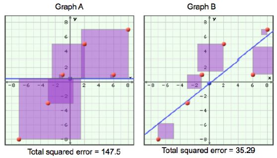 The y-values are daily maximum
temperatures, their average is 0.5 degrees celcius. The purple squares in graph A indicate the
squared error from using a simple average temperature (the line is y=0.5) to predict the value of a
single data point. In graph B the squared error is from using a model of linear regression to
predict temperature. Thus, the value of the coefficient of determination (the goodness of fit),
r 2 for the linear model in graph B is likely: a. | 0.21 | b. | zero | c. | 0.97 | d. | 0.76 | e. | 61.0 |
|
|
|
23.
|
The population of certain species of animals decreases as logging in wilderness
areas increases is most likely an example of a
a. | causal (i.e. cause-and-effect) relationship | b. | common cause
relationship (i.e. both are related to some third unknown variable) | c. | coincidental
relationship |
|
|
|
24.
|
The price of bread and canola oil both increase sharply after the prairies
experience a drought during the growing season is most likely an example of a
a. | causal (i.e. cause-and-effect) relationship | b. | common cause
relationship (i.e. both are related to some third unknown variable) | c. | coincidental
relationship |
|
|
|
25.
|
The current world price of crude oil increases as the price of gasoline at the
pump increase is most likely an example of a
a. | causal (i.e. cause-and-effect) relationship | b. | common cause
relationship (i.e. both are related to some third unknown variable) | c. | coincidental
relationship |
|
|
|
26.
|
Does the slope of a line of regression (line of best fit) tell you anything (on
its own) about the relationship of the two variables?
a. | yes, lots | b. | almost nothing | c. | nothing | d. | none of these answers is
correct |
|
|
|
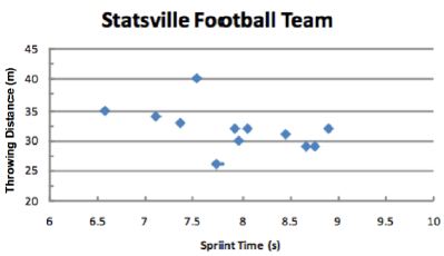
The coach of the Statsville football team wants to determine if there is a
relationship between how fast players can run 60 m and how far they can throw the football. The
results for the Statsville players are graphed in the scatterplot below.
|
|
|
27.
|
Based on the scatter plot, are there any data points that could be identified as
outliers?
a. | Yes, one. | b. | Yes, two. | c. | No,
none | d. | There are several. |
|
|
|
28.
|
If the regression line for this scatter plot is: Throwing Distance =
-3(Sprint Time) + 50, then use the model to predict the throwing distance of an athlete who
can sprint 60m in 5 seconds.
a. | 68.6 m | b. | 50 m | c. | 40
m | d. | 35 m | e. | The answer is not on this
list |
|
|
|
29.
|
Based on the scatter plot (ignoring any outliers), what type of relationship
exists between the two variables?
a. | Weak positive relationship | b. | Strong positive
relationship | c. | Weak negative relationship | d. | Strong negative
relationship | e. | No relationship |
|
|
|
30.
|
Which one of the following images showing relationships on a scatter plot would
have a correlation coefficient of r = 0.6? 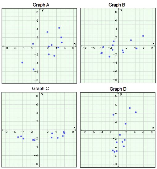 a. | graph A | b. | graph B | c. | graph
C | d. | graph D | e. | all of them | f. | none of
them |
|
|
|
31.
|
Why are the upper and lower limits of bollinger bands or a regression channel
defined by ± 2 standard deviations?
a. | This will encompass all the data points that can occur | b. | They define the
upper and lower limits of the trend | c. | Because one expects only 1 in 20 data points to
exceed these limits | d. | None of the
above |
|
|
|
32.
|
Why is ß represented by the slope of a least-squares line when you plot a
security’s return against the market return on a scatter plot?
a. | Because it’s a mathematically precise way of finding the trend
line. | b. | It’s a more accurate way of finding standard deviation | c. | Because slope
measures the magnitude of y’s change to x’s change | d. | Because you need to
know R2 to use it. |
|
|
|
33.
|
Which definition does not represent expected value?
a. | A weighted average | b. | The value outcome that is most
likely | c. | The probability of a value outcome. | d. | The per trial value you would expect to
get |
|
|
|
34.
|
What are the only two values needed to describe a normal probability
distribution?
a. | Beta and standard deviation | b. | Standard deviation and
median | c. | Range and average | d. | Average and standard
deviation | e. | Mean and probability |
|
|
|
35.
|
Which of the following coloured lines would correspond to a normal distribution
with standard deviation = 0.5 and 0.7 respectively? 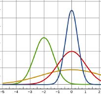 a. | Blue and green | b. | Red and gold | c. | Blue and
gold | d. | Green and red |
|